FUROA SEOUL
Brand Identity for FUROA SEOUL
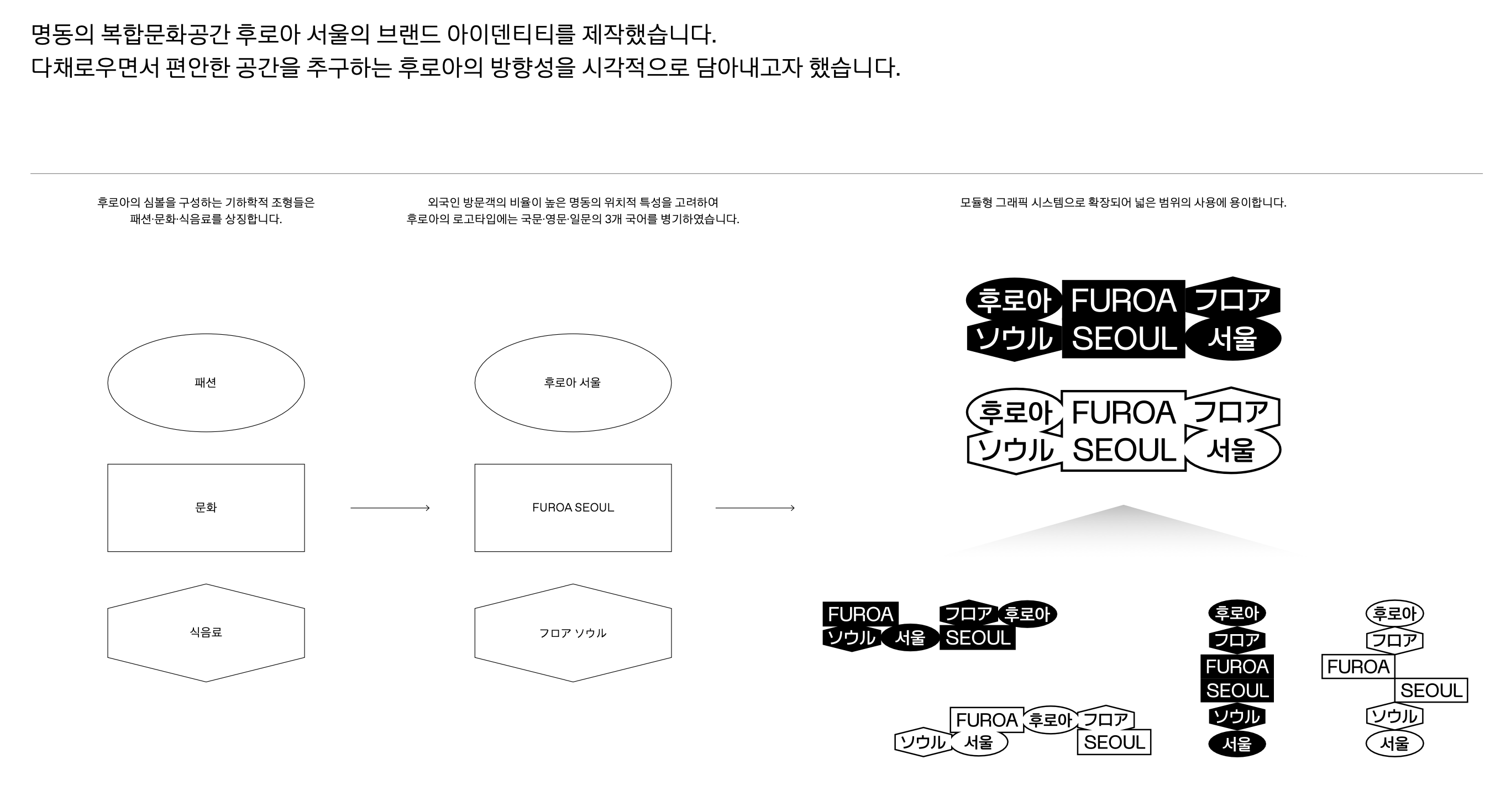
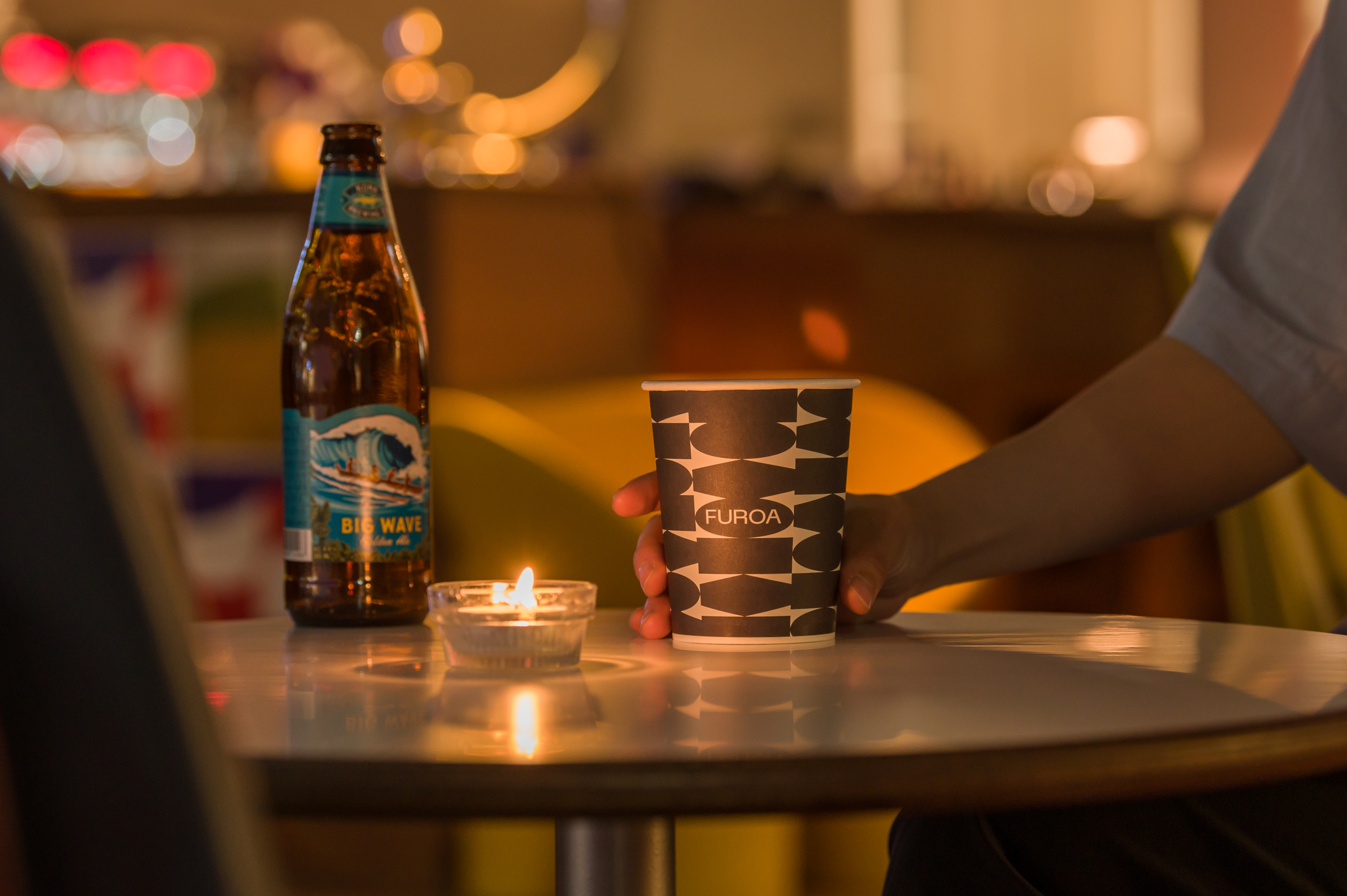
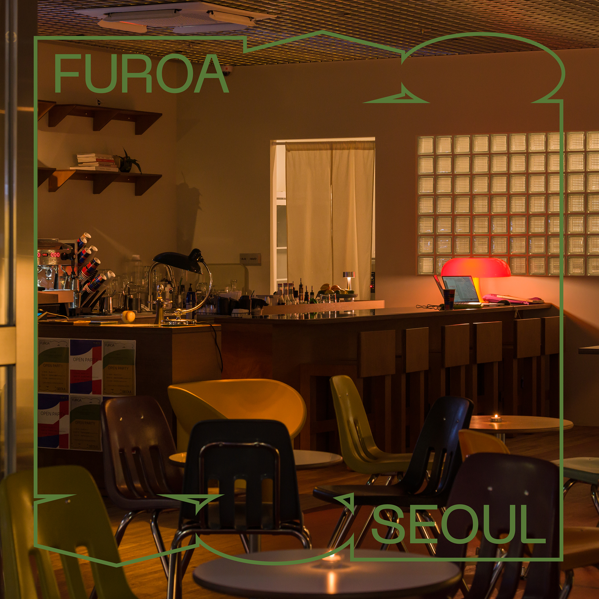
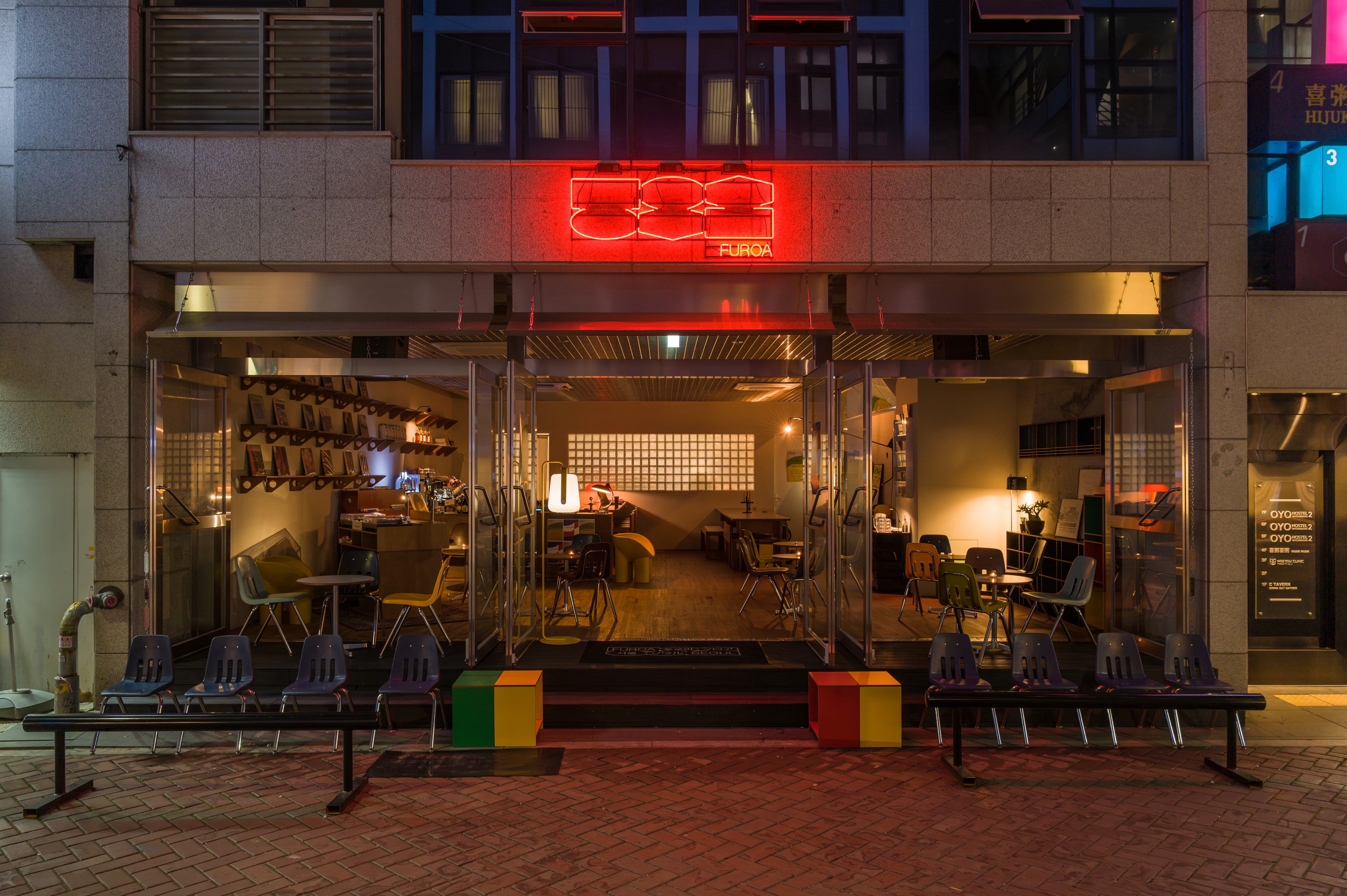
복합문화공간 후로아 서울의 브랜드 아이덴티티를 디자인했습니다. 다채로우면서 편안한 공간을 추구하는 후로아의 방향성을 시각적으로 담아내고자 했습니다.
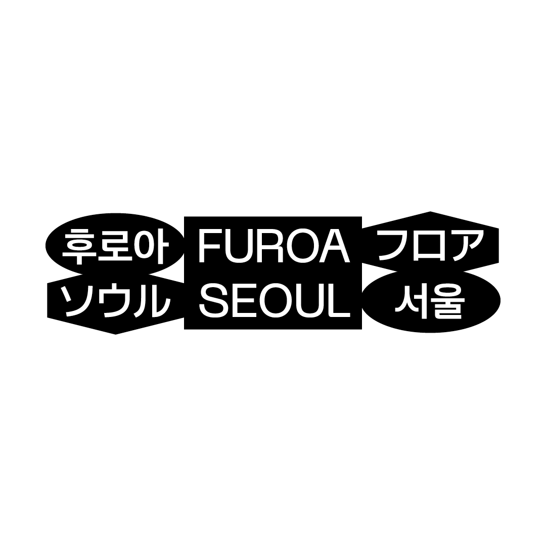
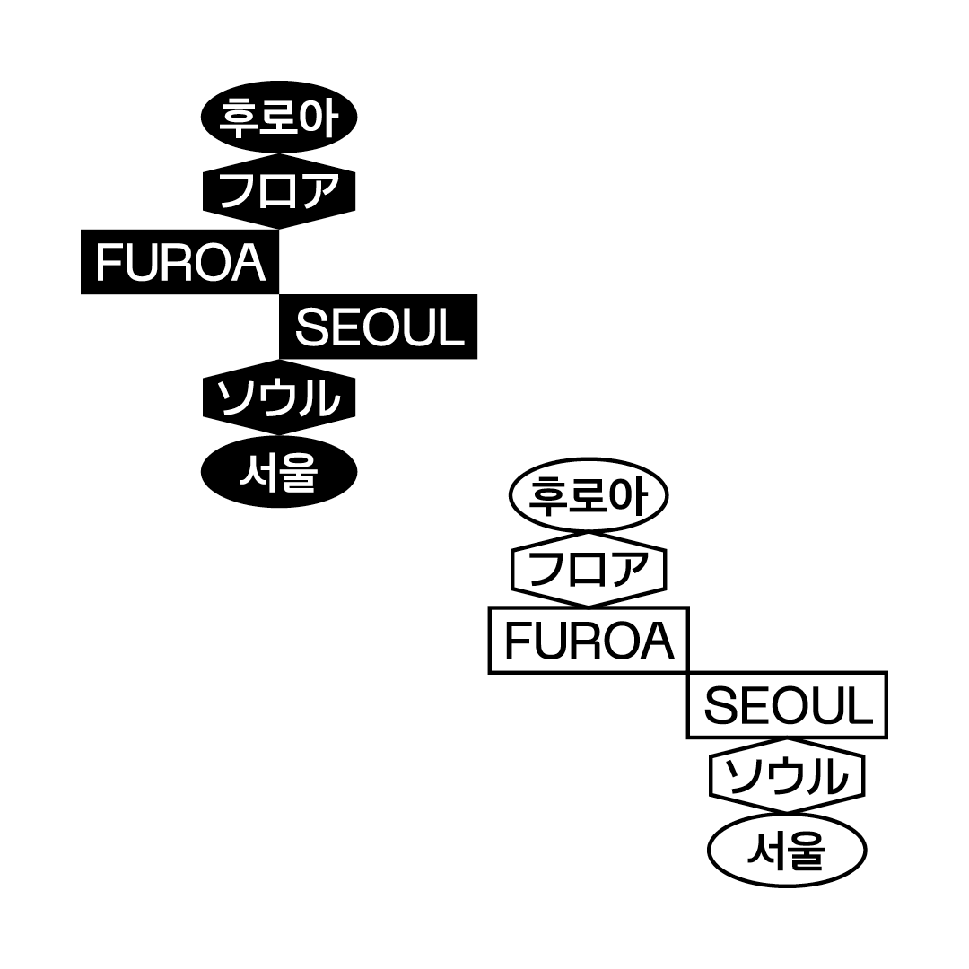
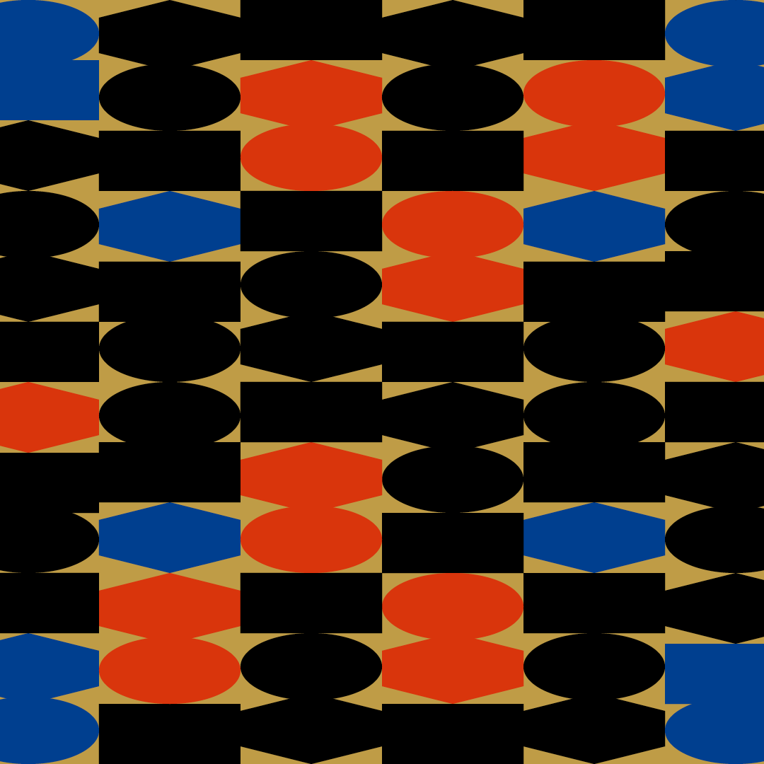
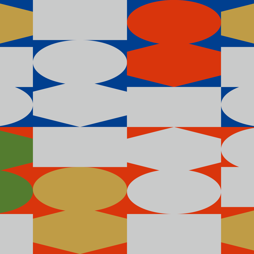
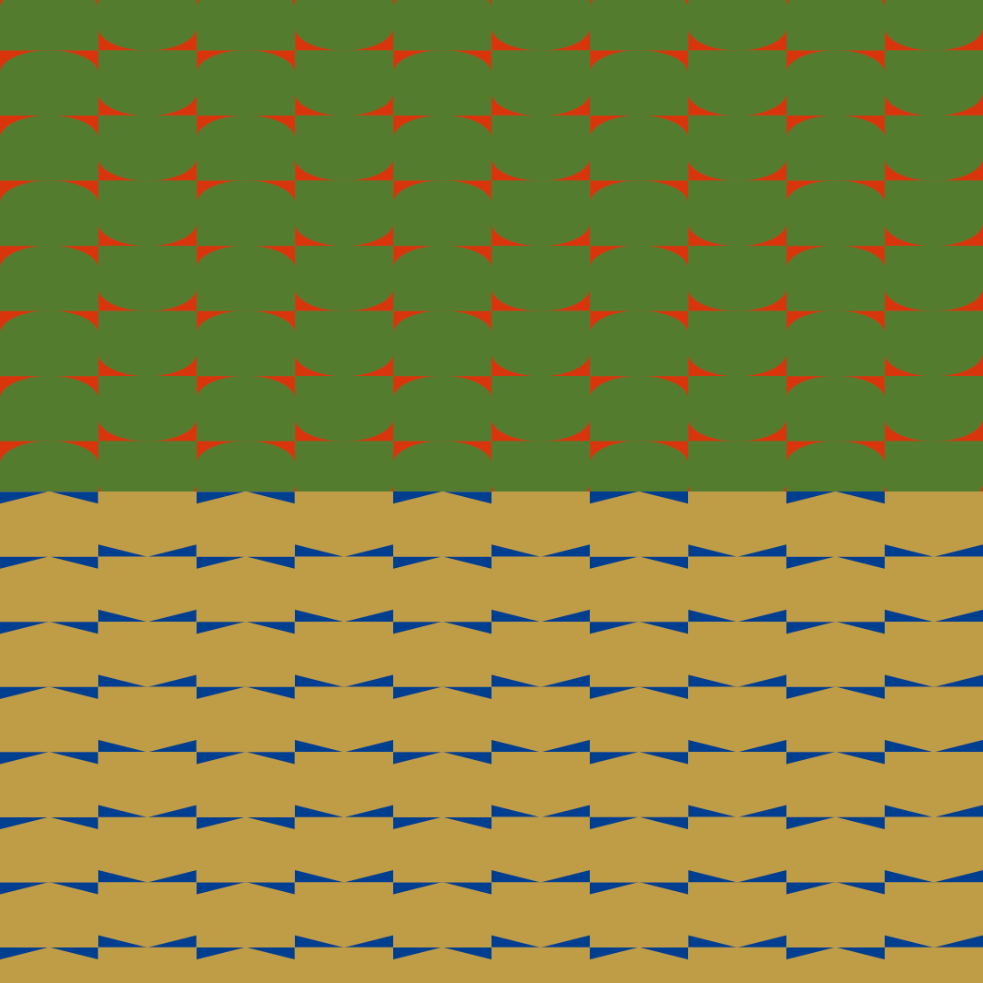
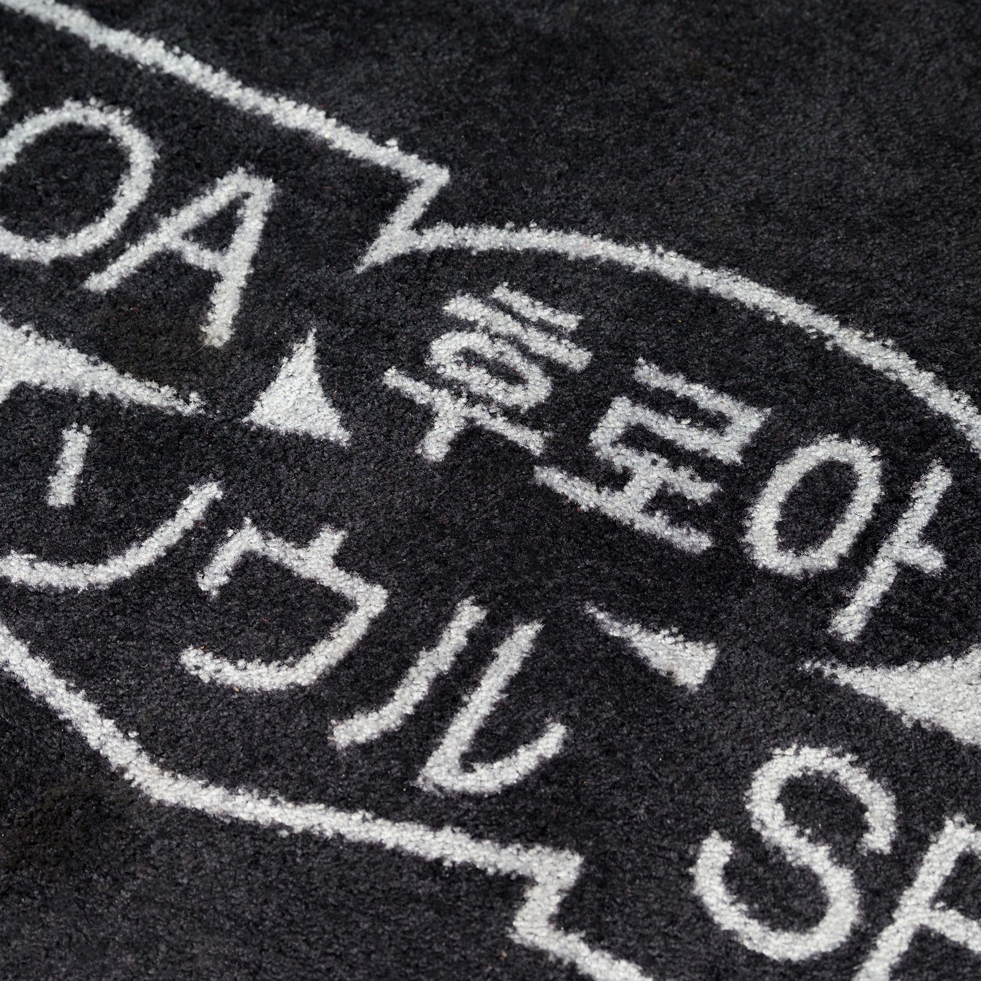
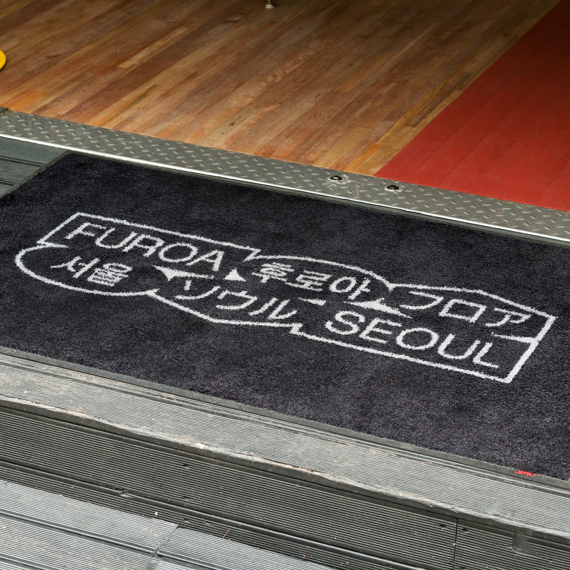
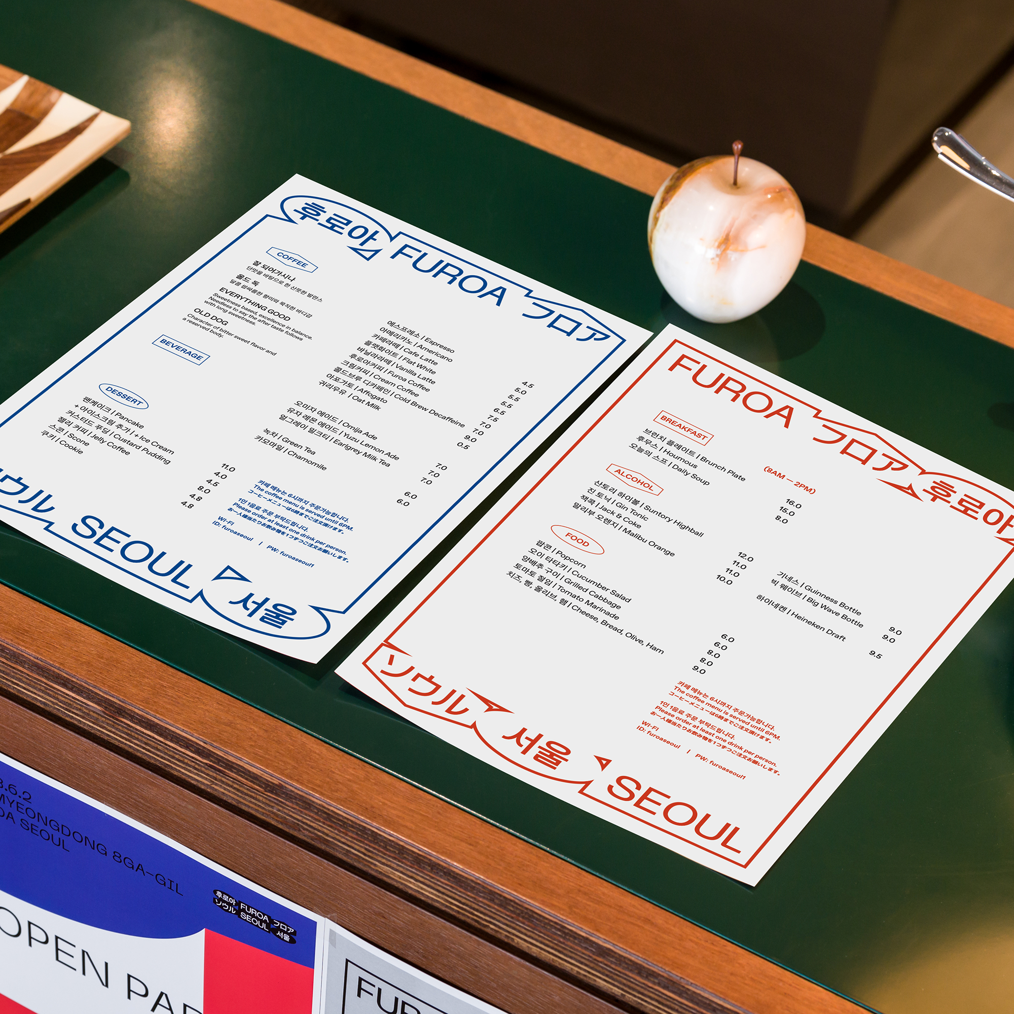
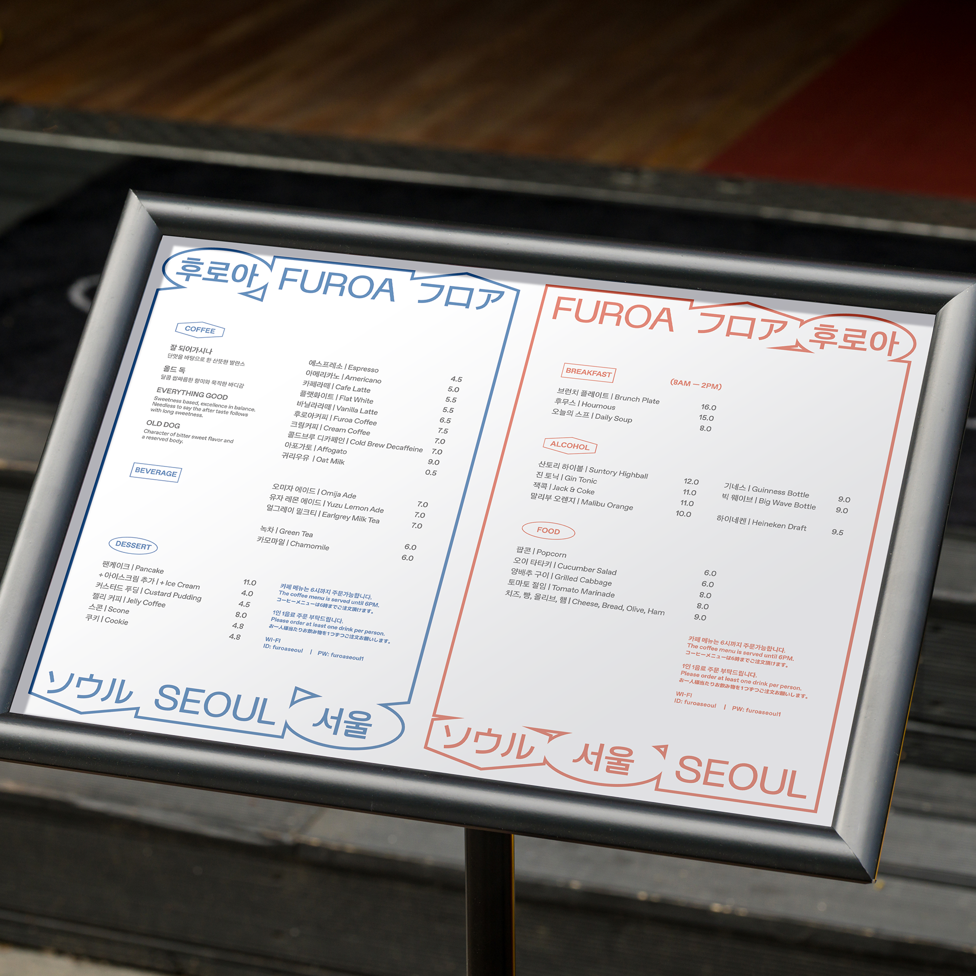
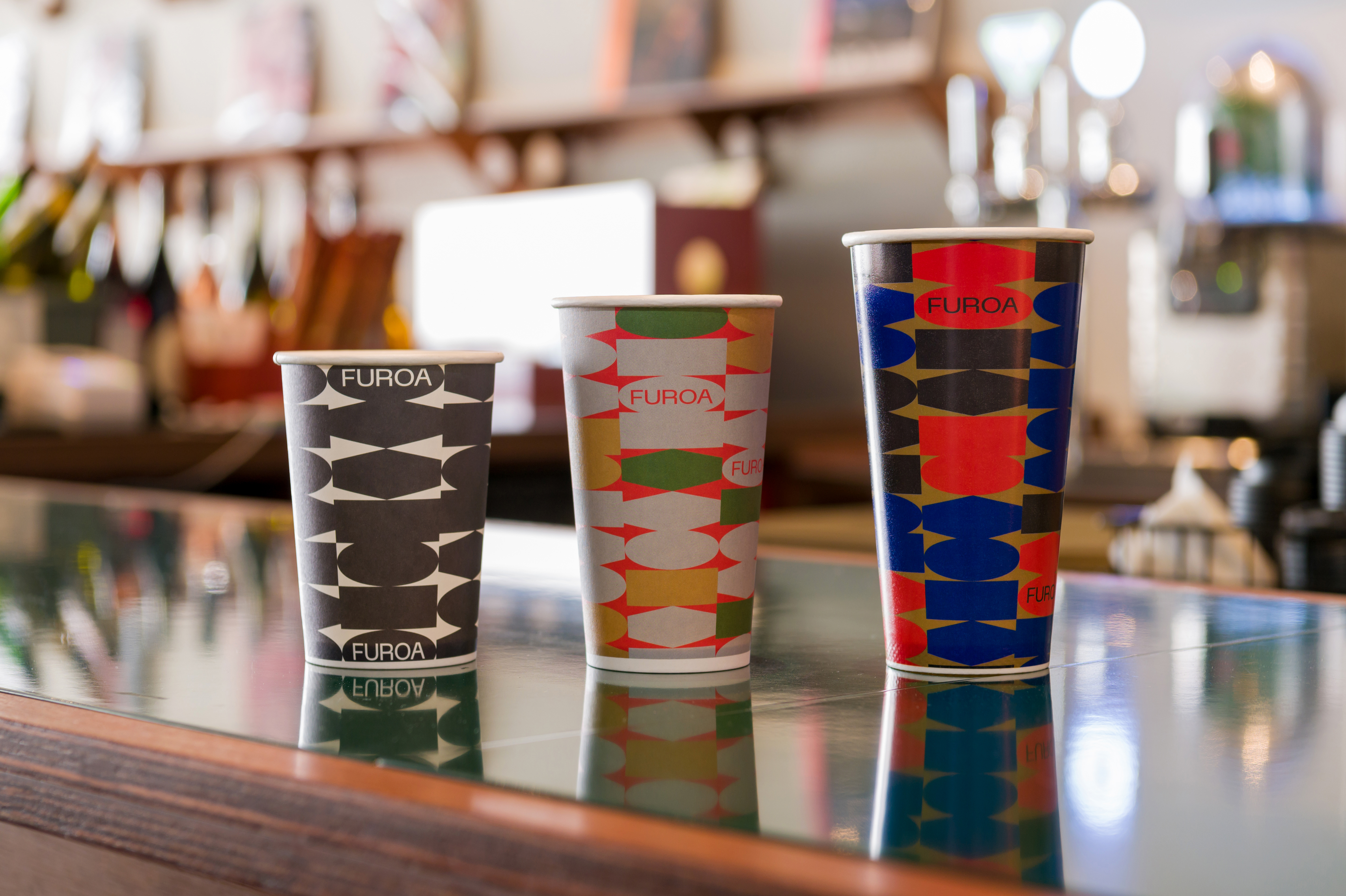
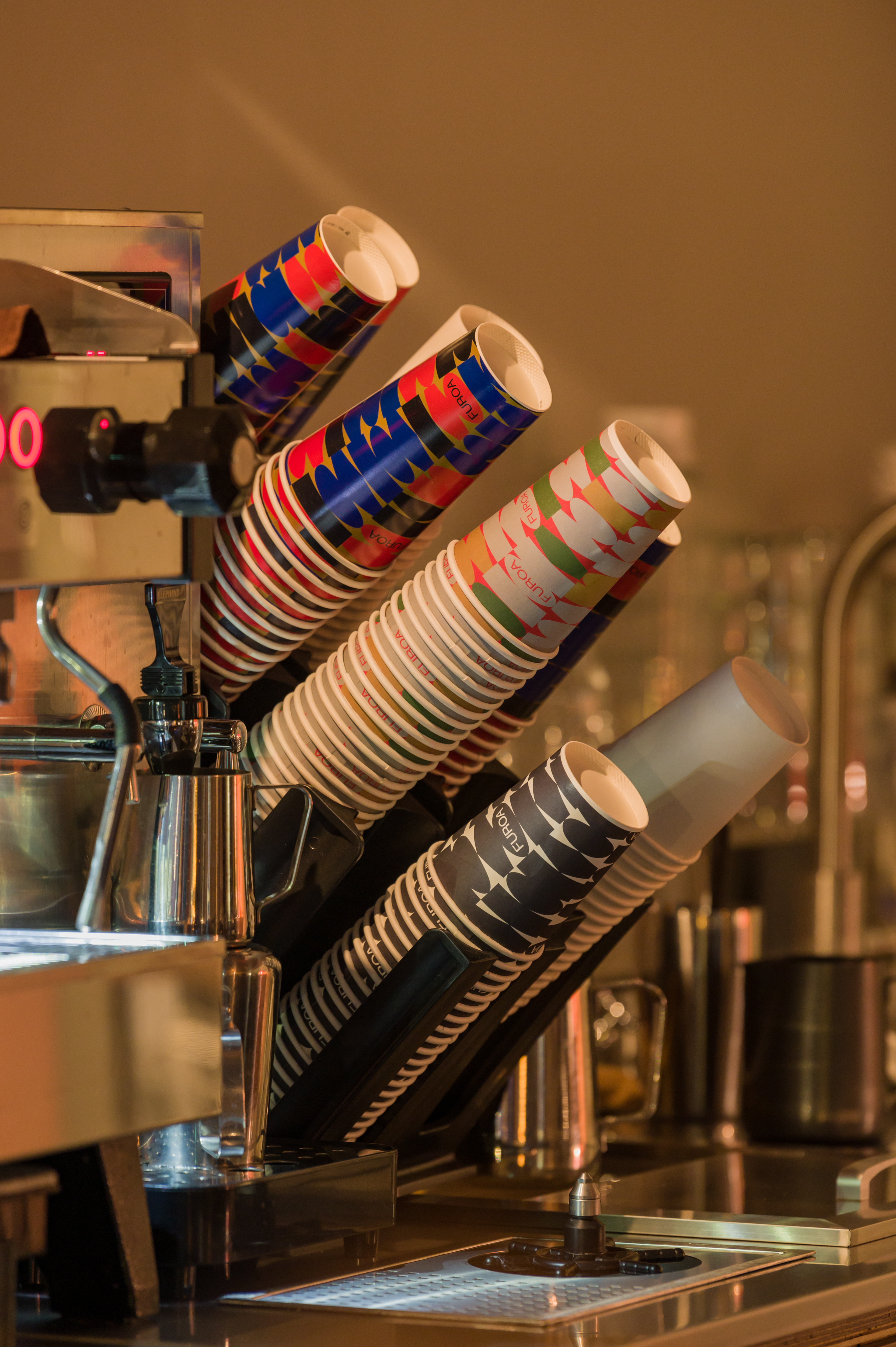
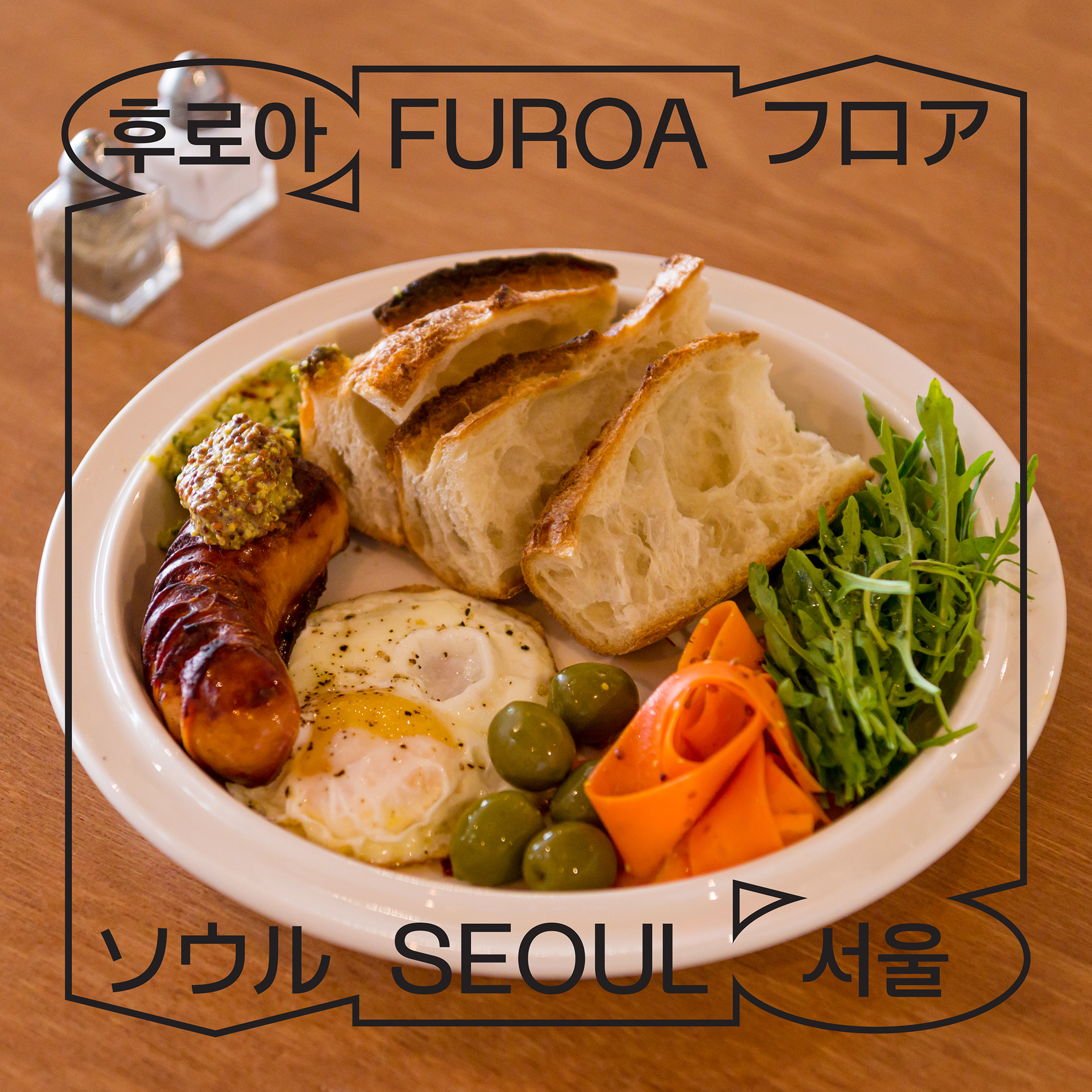
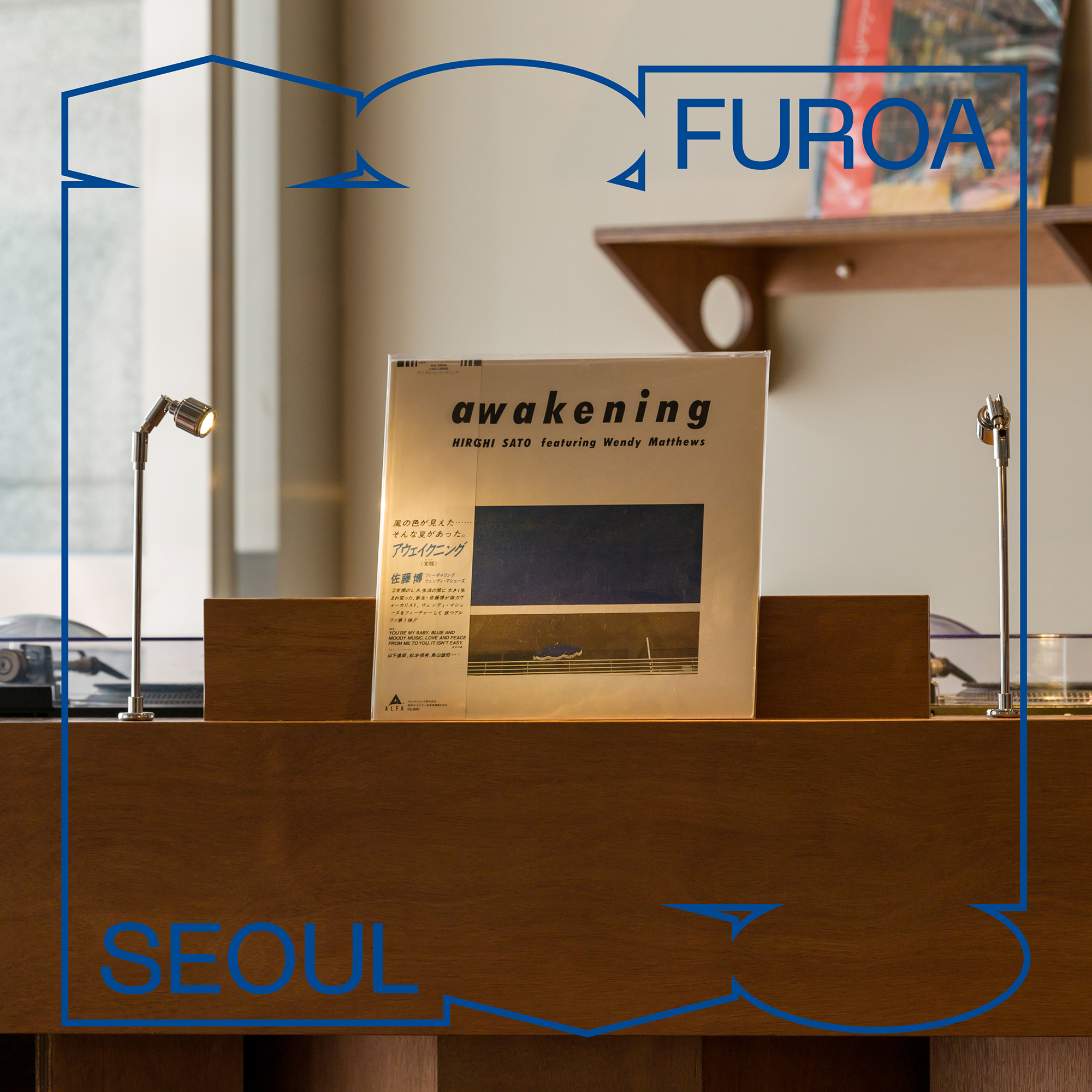
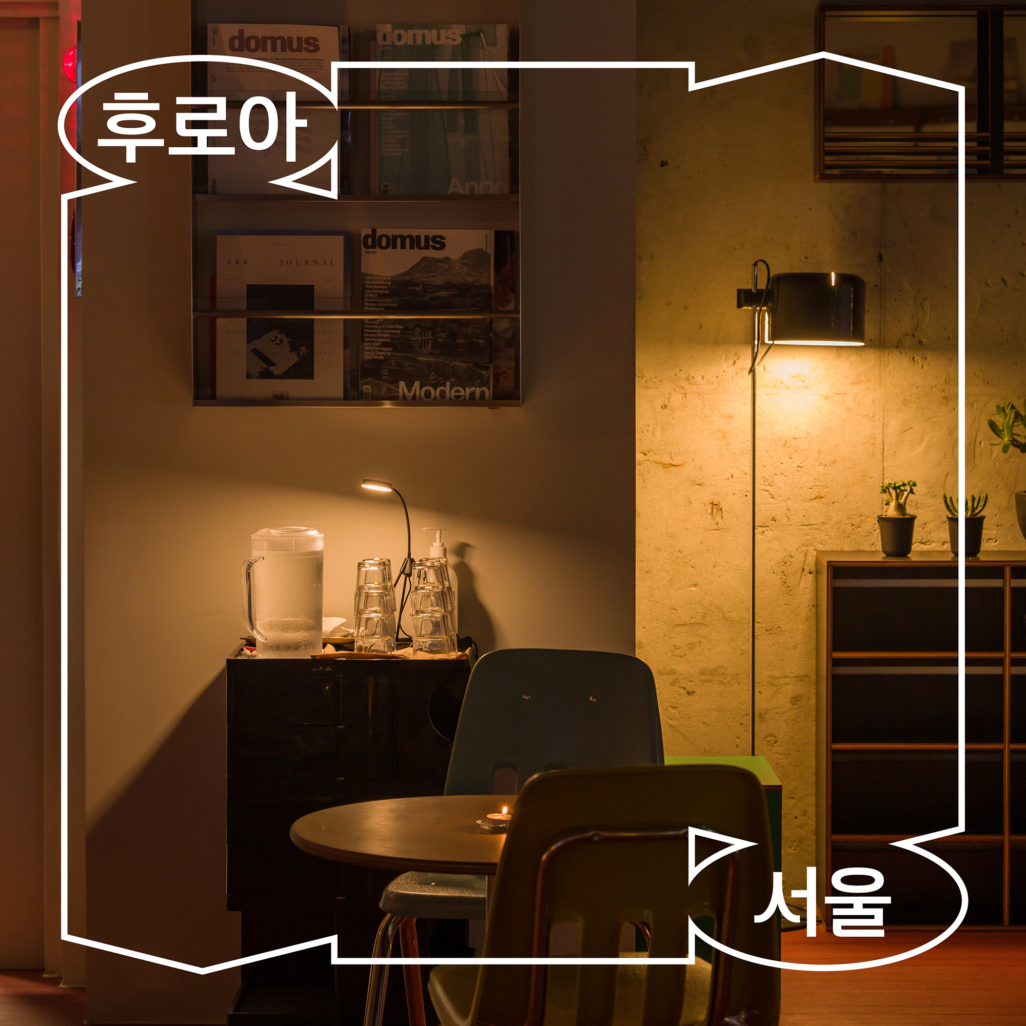
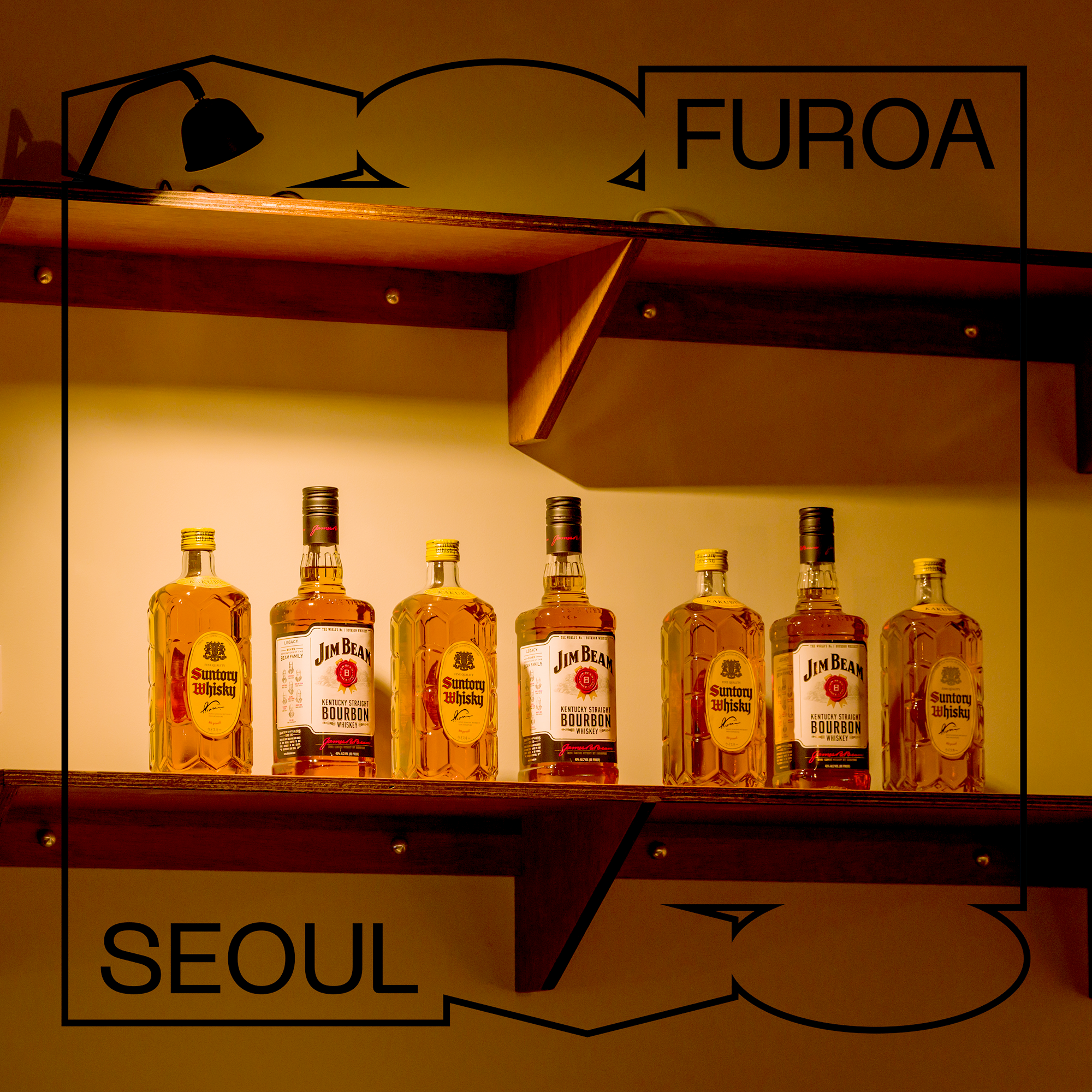
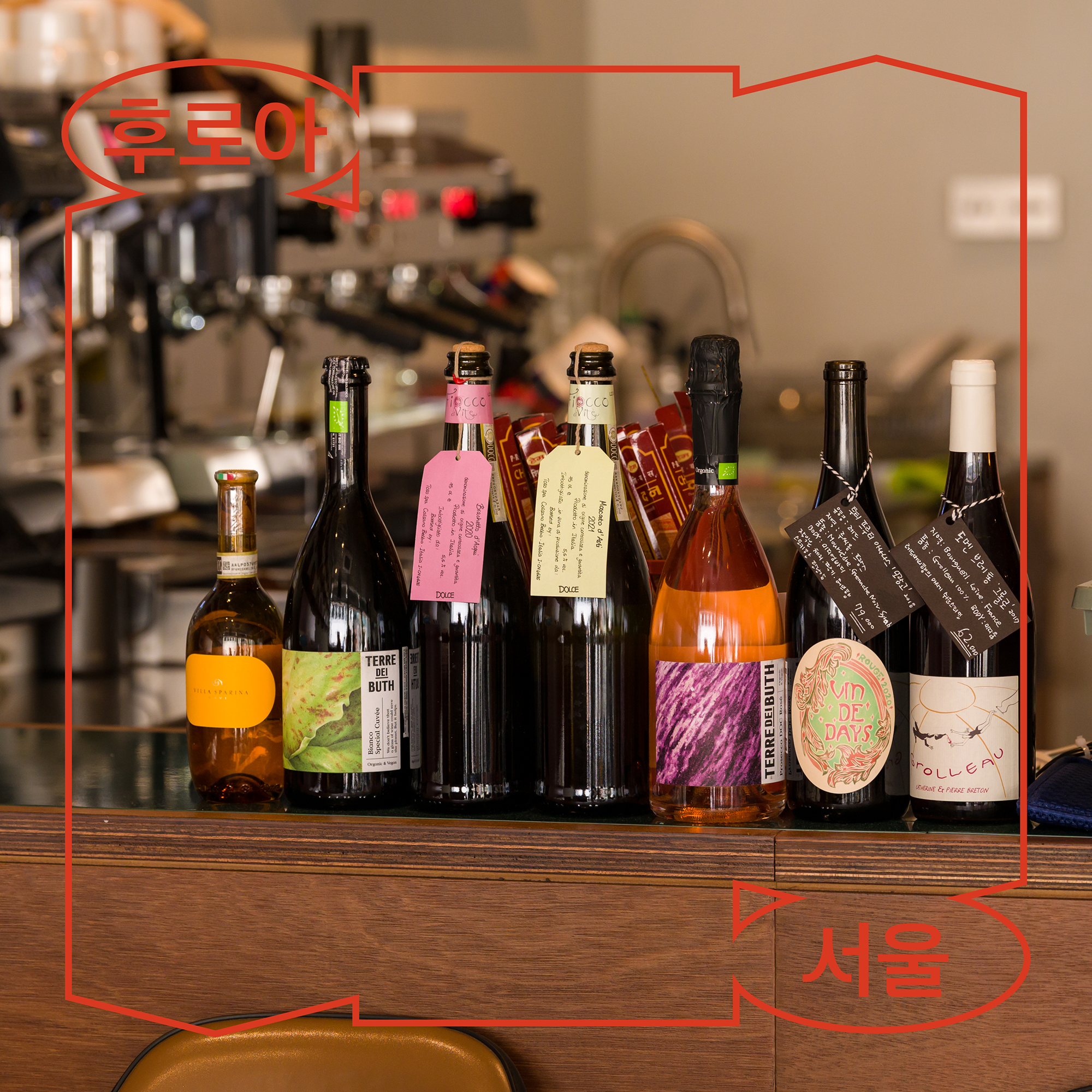
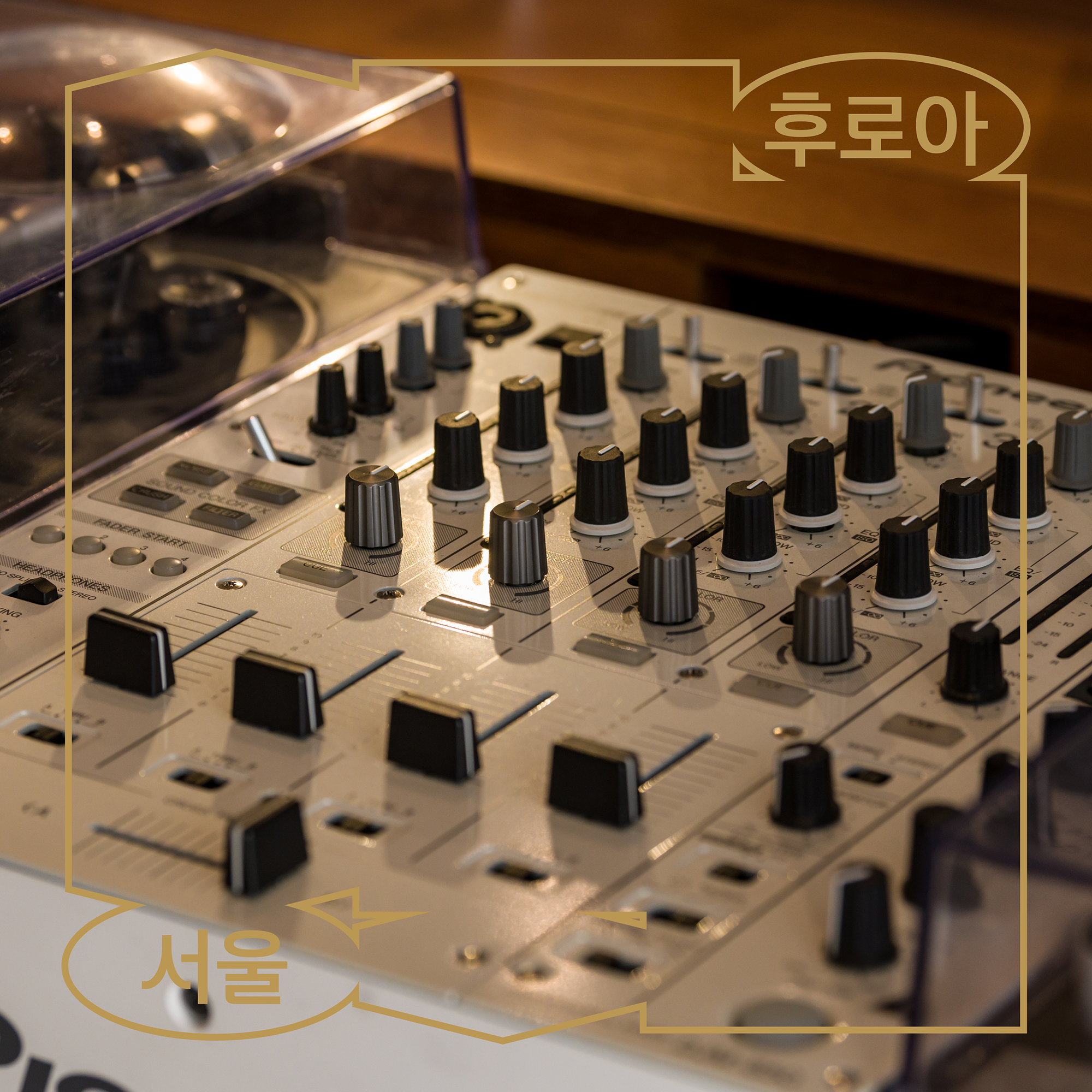
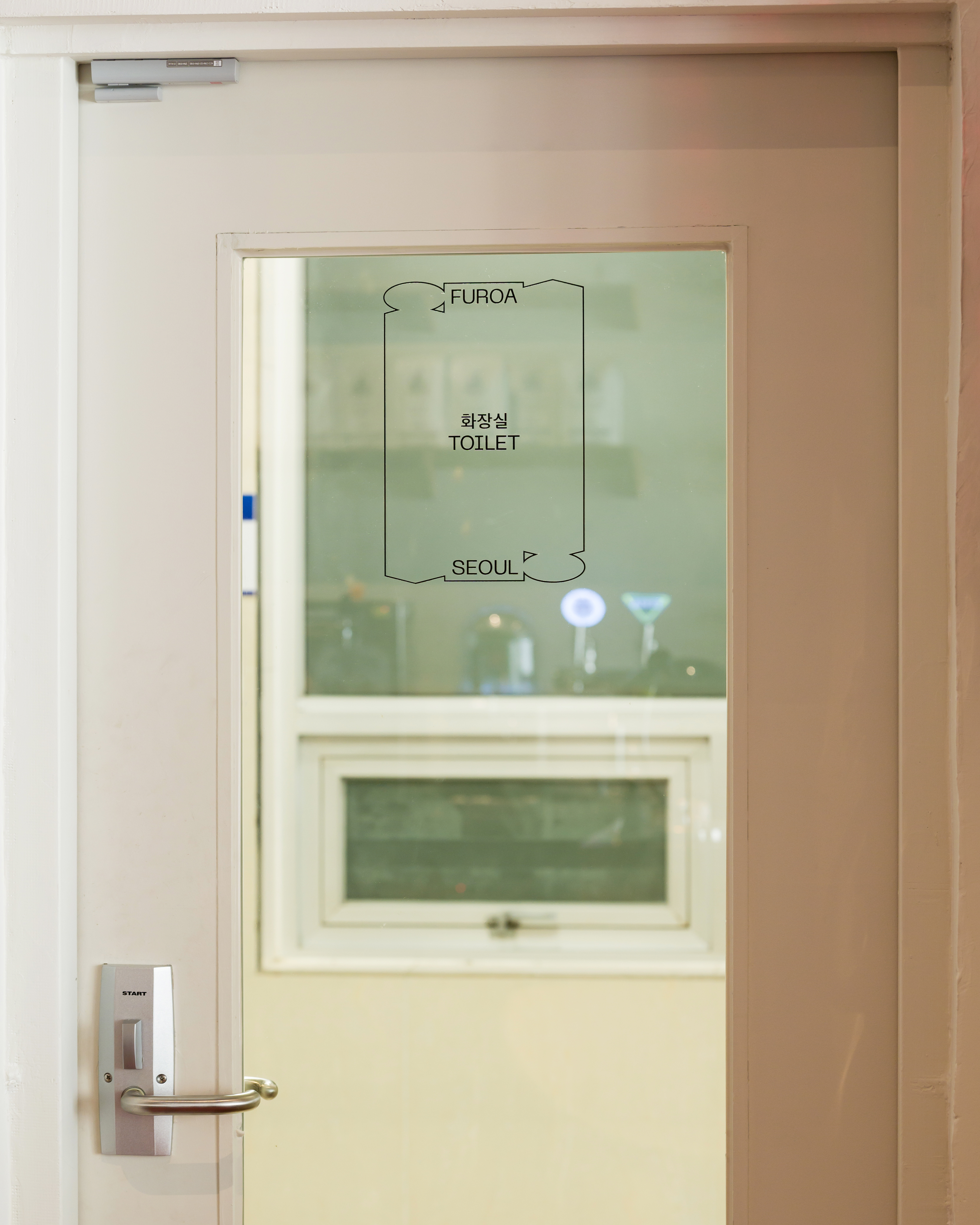
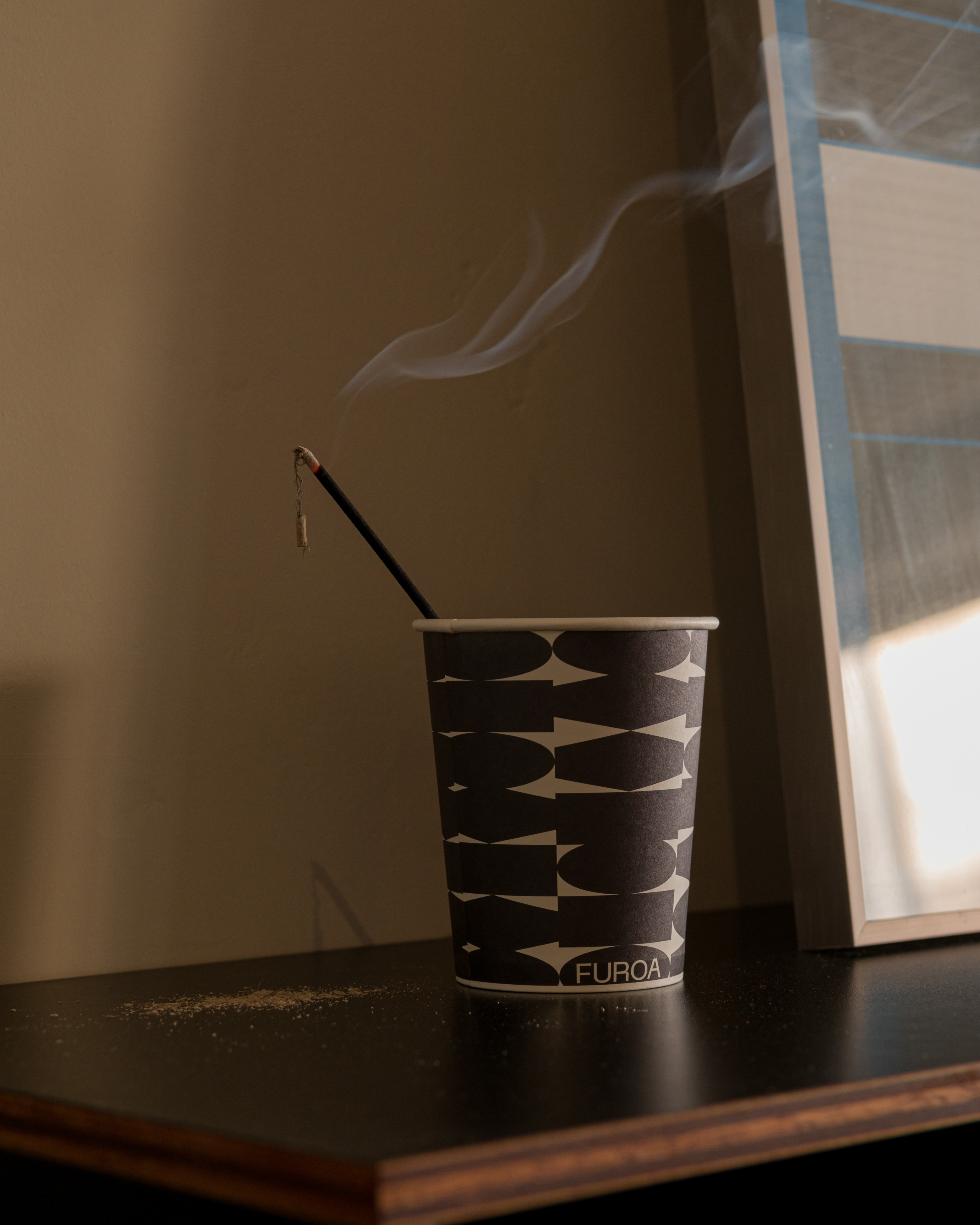
후로아의 심볼을 구성하는 기하학적 조형들은 패션·문화·식음료를 상징하며, 이는 모듈형 그래픽 시스템으로 확장되어 넓은 범위의 사용에 용이합니다.
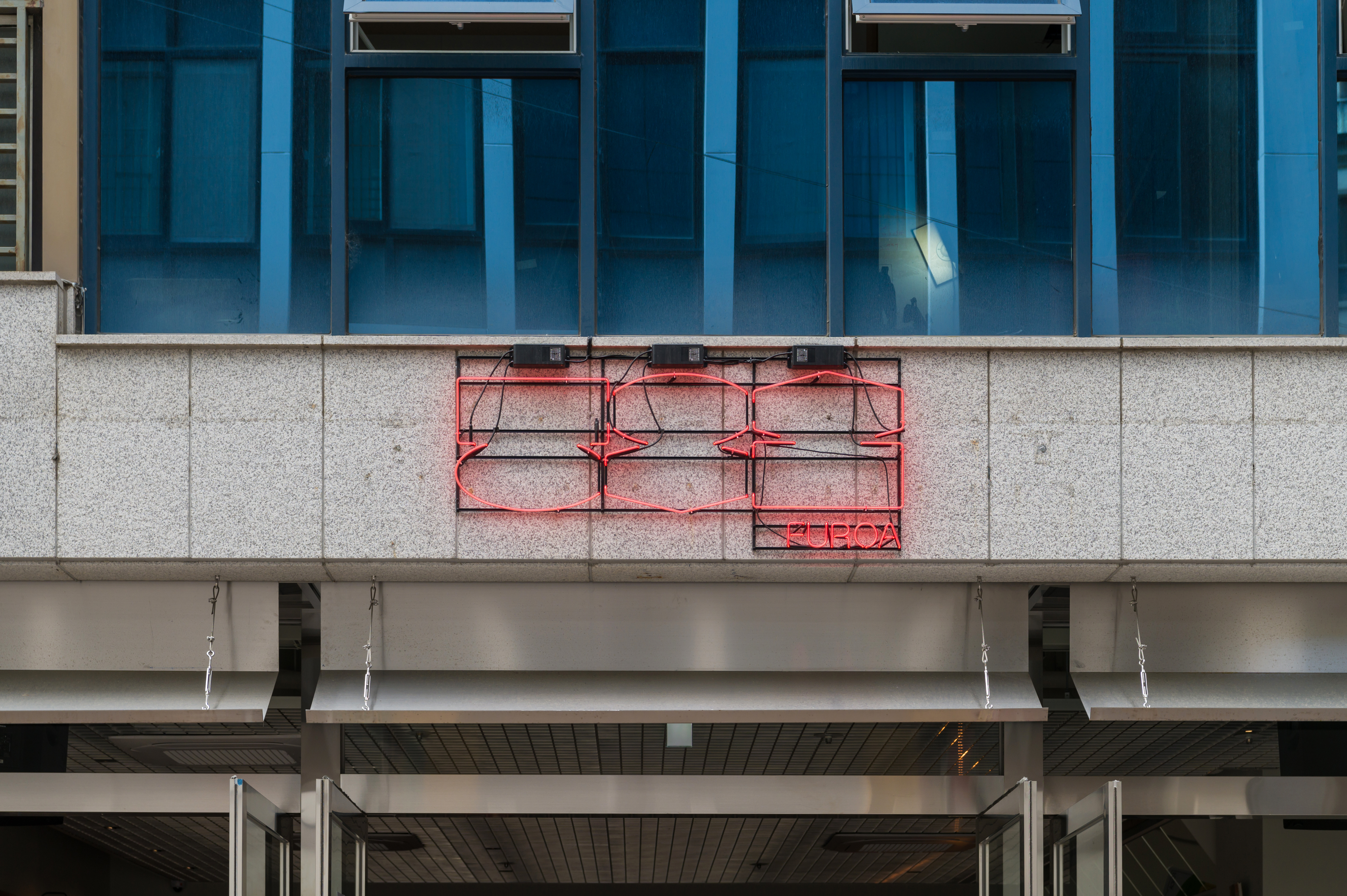
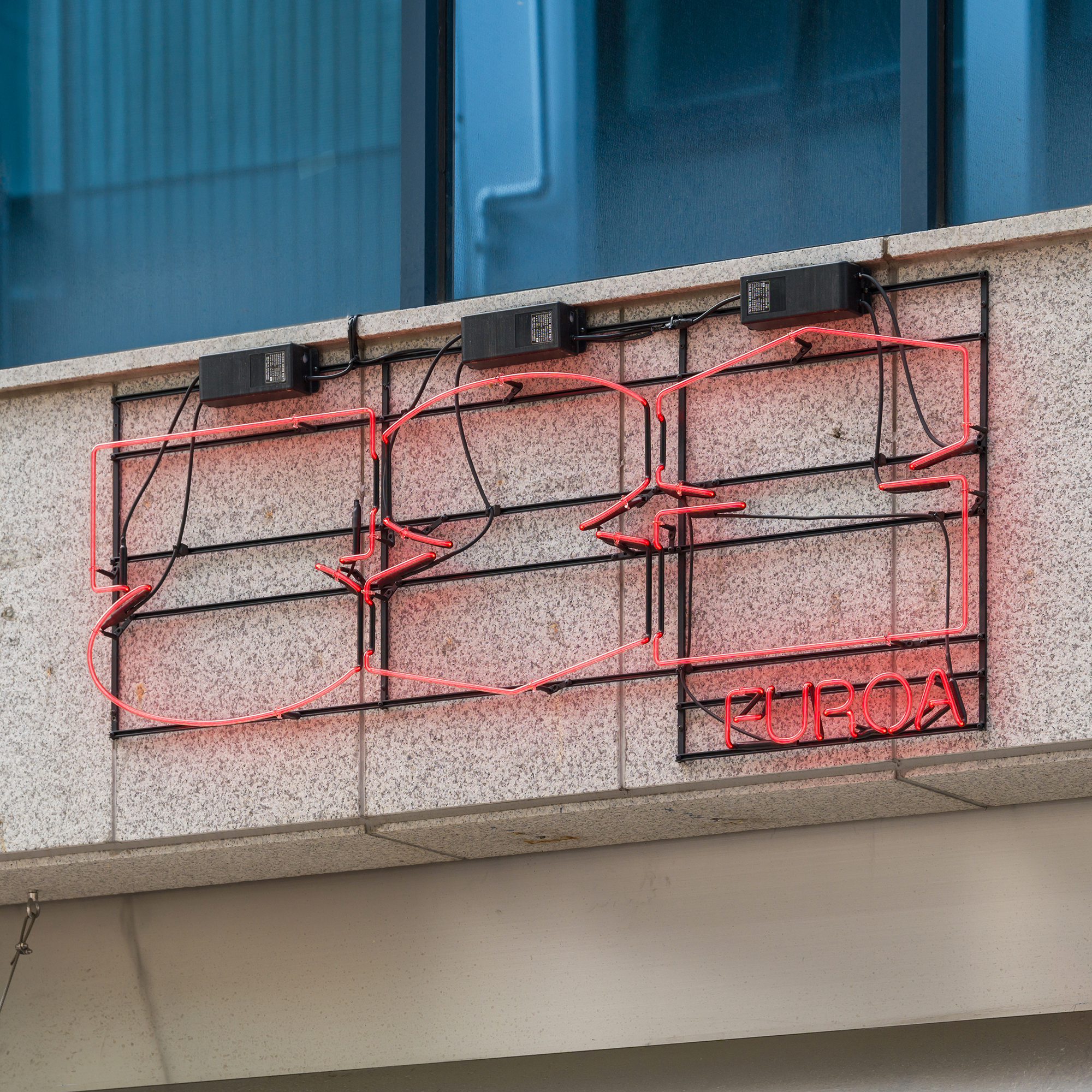
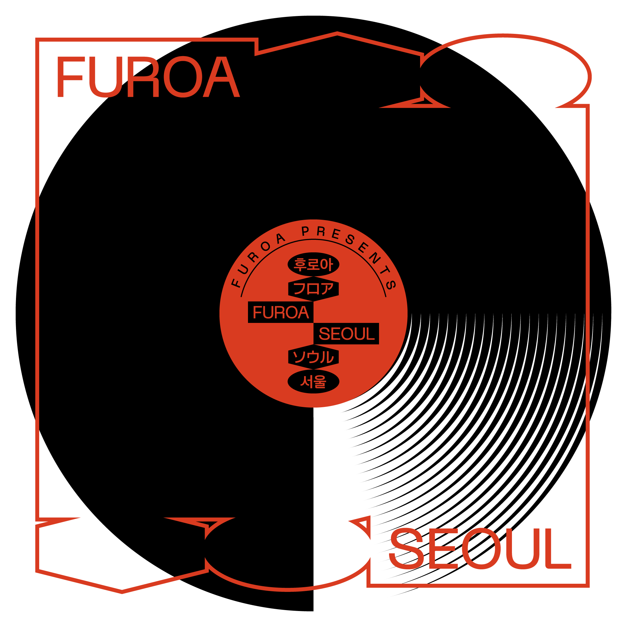
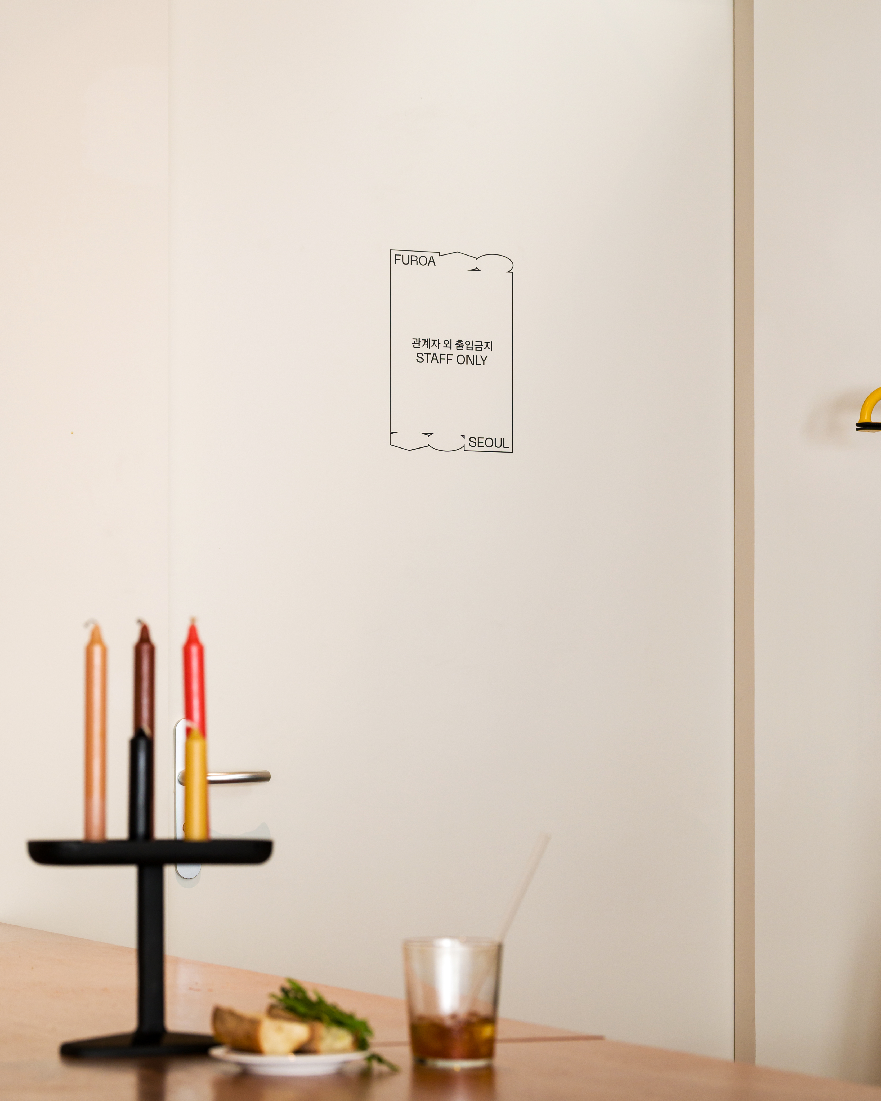
외국인 방문객의 비율이 높은 명동의 위치적 특성을 고려하여 후로아의 로고타입에는 국문·영문·일문의 3개 국어를 병기하였습니다.
RSG WORKS designed the brand identity of FUROA SEOUL, a complex cultural space. We wanted to capture FUROA’s pursuit of being a colorful and comfortable space.
The symbol of FUROA is made with the geometric shapes which symbolize fashion, culture, food and beverage. This symbol is easy to use in a wide range by being expanded into a modular graphic system. Considering the locational characteristic of Myeong-dong, which has a high rate of foreign visitors, the logotype of FUROA is written in three languages: Korean, English, and Japanese.
CLIENT
FUROA SEOUL
FUROA SEOUL